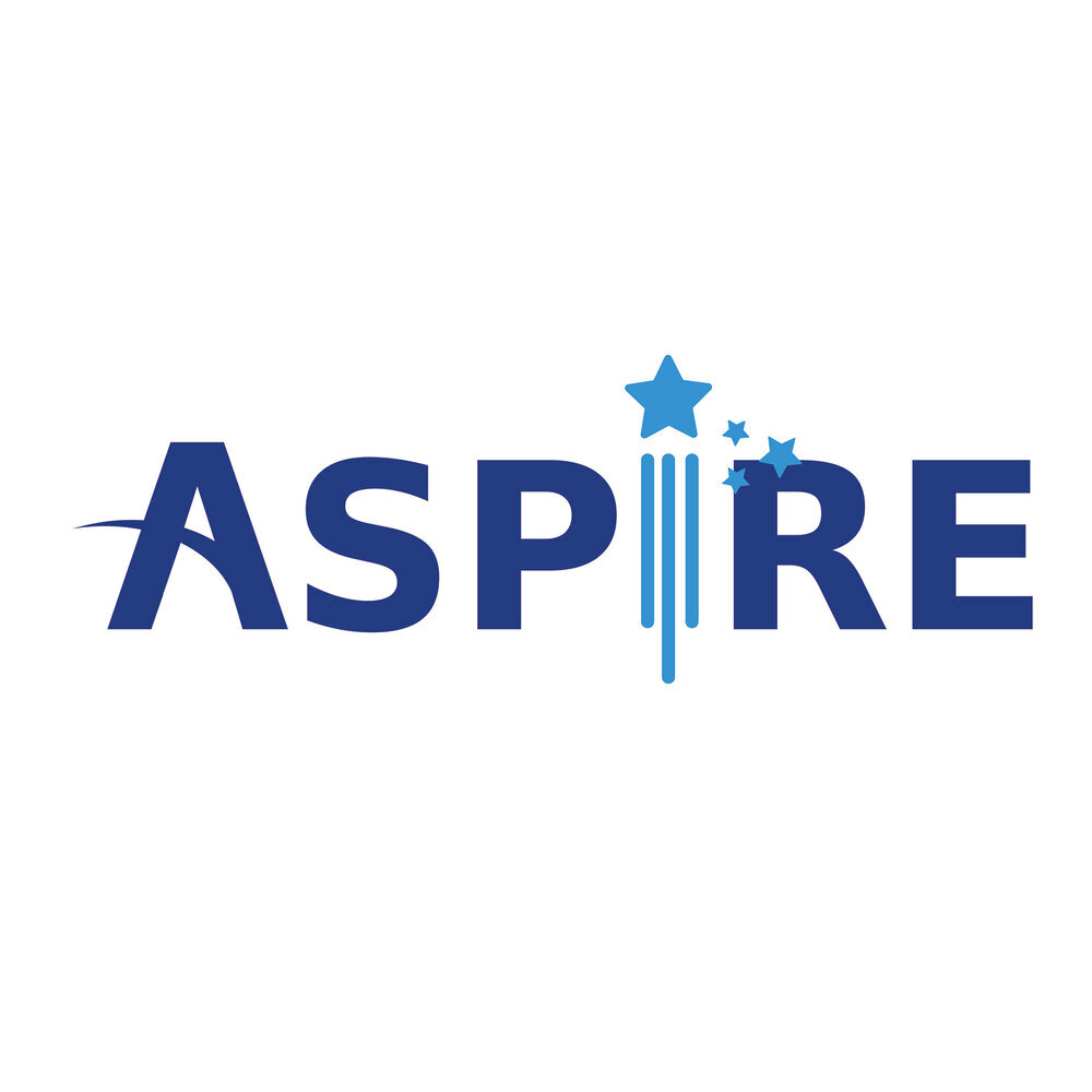
aspire
Aspire, Office Management Training
This logo was designed for our client Aspire, an office management training company. The goal for this project was to create a distinct brand identity for Aspire and create a logo that not only reflects the brand, but converts into sales/awareness.

For branding we chose earthy colors. We chose these colors to show a person/individual growing and progressing in life. These colors represent growth and potential in order for a person to reach the next level through the help of Aspire.

Target Audience
Aspire targets businesses, organizations and philanthropy groups who have clients in need of job training in order to gain employment.
Project (Logo & Collateral)
Stars and bridge-like shapes represent the need in the community of a gap needing to be filled. This inspired the look for the logo design where growth, potential and unity needed representation.
The goal of this logo was to influence, encourage and build trust between the company and its’ clients.