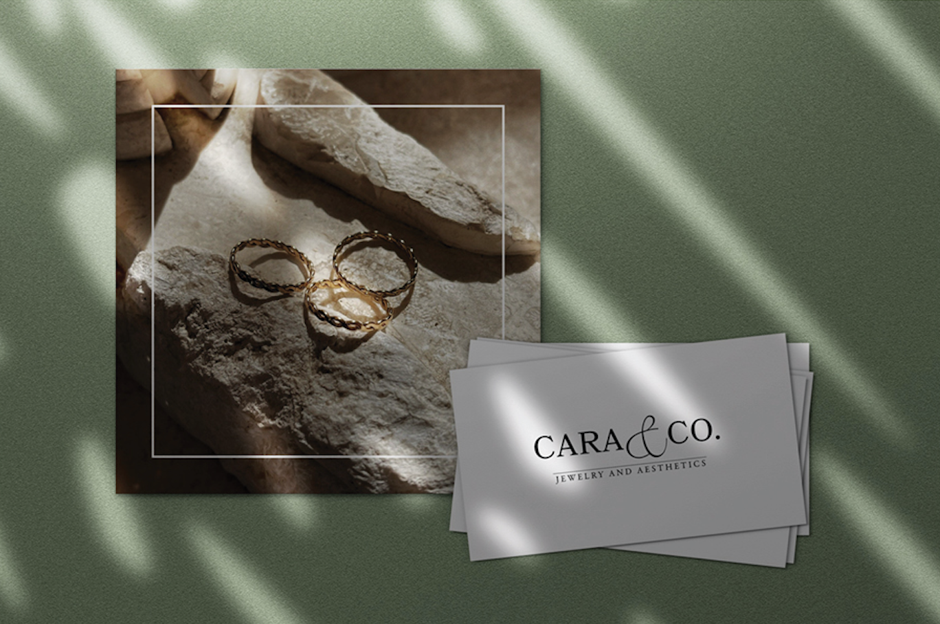

Cara and Co. Accessories and Aesthetics
This logo was designed for our client Cara and Co. Accessories and Aesthetics, an up-and-coming luxury jewelry brand, dedicated to inspiring a diverse audience of women through uplifting messaging and high-quality products. The goal for this project was to create a distinct brand identity for Cara and Co. and create a logo that not only reflects the brand but converts it into exposure/awareness.
Designed by Lead Designer, Brianna Jelks

For branding, we chose soft, cool, and neutral tones. We chose these colors to show that a person/individual has his/her/their power to choose their own life choices. These colors represent a minimalist aesthetic that reflects the design of her products and emphasizes that “Less is More.”
Target Audience
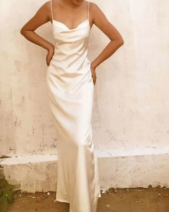
Cara and Co. targets women who wish to indulge in luxury jewelry and accessories while maintaining a minimal approach.
Project (Logo & Collateral)
The modern typography paired with the natural textures, and neutral tones, represents a luxury experience while maintaining the minimal approach. The font used in this logo was chosen strategically to attract women who wish to enhance their jewelry life, without going over the top.
The goal of this logo was to minimize yet enhance, and build trust between the company and its’ clients. Less is more.