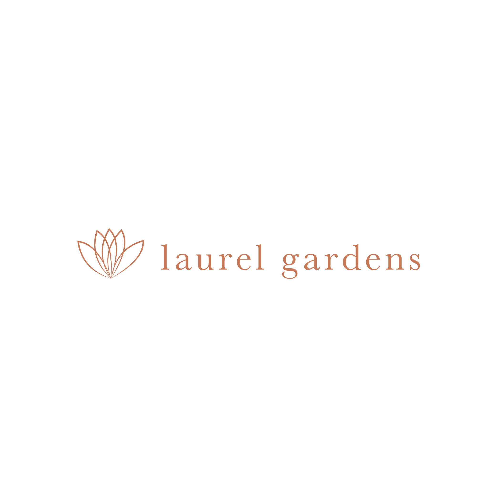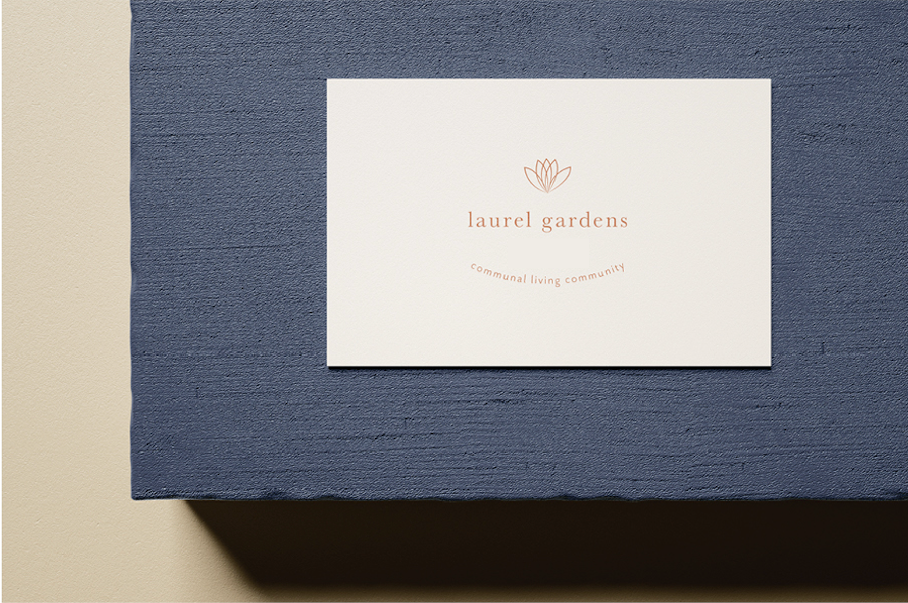
laurel gardens
This logo was designed for our client Laurel Gardens, a communal living facility established in 2002, dedicated to empowering seniors, veterans, and those who are physically disabled by providing an independent living space for them to be autonomous and create a community. The goal for this project was to create a distinct brand identity for Laurel Gardens and create a logo that not only reflects the brand but converts it into exposure/awareness.
Designed by Lead Designer, Brianna Jelks

For branding, we chose welcoming, family, and cozy tones. We chose these colors to show that any person/individual is welcomed and has the power to be independent while living in the communal living facility. These colors represent an independent aesthetic that reflects the mission of her services and emphasizes “community".”

Target Audience
Laurel Gardens targets 75+ elderly, veterans, or physically disabled men and women.
Project (Logo & Collateral)
The modern typography paired with the natural textures, and neutral tones, represents a home experience. The font used in this logo was chosen strategically to attract individuals who wish to explore a living style that allows them to be autonomous while keeping the community in touch.
The goal of this logo was to minimize yet enhance, and build trust between the company and its’ clients.