the queen’s crowns
This logo was designed for our client The Queen’s Crowns, a blog made for Millennial and Gen X Black women of all walks of life to read about experiences that mirror their own and make them feel seen and heard in a safe space. The goal for this project was to create a distinct brand identity for The Queen’s Crowns and create a logo that not only reflects the brand but emphasizes the safe space women can be heard in.
Designed by Lead Designer, Brianna Jelks

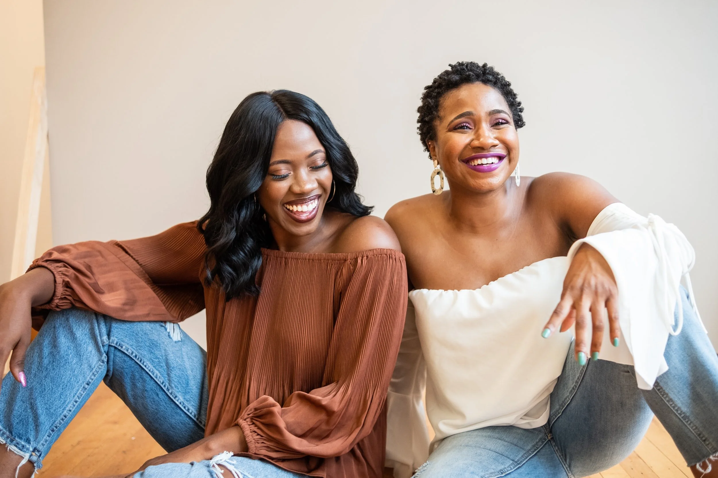
For branding, we chose safe, welcoming, and soft tones. We chose these colors to show that any person/individual is welcomed and can feel safe knowing that they will be heard. These colors represent a health and wellness aesthetic that reflects the mission of her services and emphasizes “Women’s Wellbeing".”
Target Audience
The Queen’s Crowns targets 35 - 44 year-old Black women, Millennials, and Gen X.
Project (Logo & Collateral)
The modern typography paired with the soft textures, and neutral tones represent a welcoming experience. The font used in this logo was chosen strategically to attract individuals who need a safe space to explore and not feel alone.
The goal of this logo was to minimize yet enhance, and build trust between the company and its’ clients.
